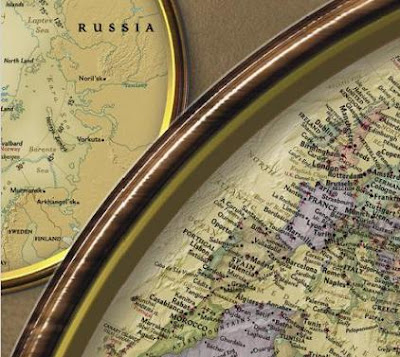
 National Geographic’s new World Hemispheres map draws its inspiration from some of the classic National Geographic world maps of the 1930s and 1940s.
While most modern world maps show the world as a whole, the hemispheres map was designed by NG Maps using a projection that separates the Eastern and Western hemispheres.
This unique projection shows continents and regions in truer proportion to each other than most other map projections are able to achieve. The map features updated, modern cartography and an elegant earth-tone color palette.

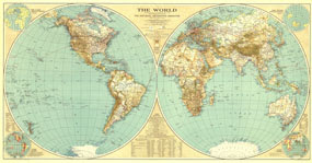
December 1935
NG Maps produced its first hemisphere world map for the December 1935 NGM. The map was created under the tutelage of chief cartographer James Darley and designed by Charles E. Riddiford. It featured insets that showed views of the Earth’s “Land Hemisphere” and its “Water Hemisphere” as well as insets showing the world’s time zones. It also listed some facts about the Earth, including its polar and equatorial diameters; its total area (196,950,284 square miles); the mass of the atmosphere, water, ice, lithosphere; and the total mass of the Earth.
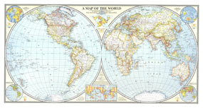
December 1941
The 1935 map was followed by an updated version in December 1941. Albert H. Bumstead was the chief cartographer for this gem, with a “Culture” inset by James Darley and a “Physiography” inset by Charles E. Riddiford. The 1941 map had a decidedly brighter palette than its predecessor, and featured several insets, perhaps the most interesting of which was a star-shaped projection that showed the relative accuracy of the mapping information by region.

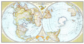
April 1943
In April 1943, a world map was published, though instead of featuring the Eastern and Western hemispheres, it showed the Northern and Southern hemispheres. James Darley was chief cartographer, and Charles E. Riddiford designed the map. This fascinating worldview highlights the land mass of the Northern Hemisphere and the relatively close proximity of North America to the USSR and northern Europe. For the first time on an NG world map, air distances were shown between cites across the globe.
Look for the new World Hemispheres map at your favorite map store or online map retailer.
Look for the new World Hemispheres map at your favorite map store or online map retailer.


2 comments:
Hello!
My name is Donatas Bruzas. I am a software engineering student in Lithuania.
I am also a hobbyist map collector.
I do not want to be offensive, but I am not really pleased by this new world map. I want my criticism to be constructive.
I am sorry, but I see the main difference between this new world map and those maps from the past. The old maps were functionally perfect, they were True maps. Their beauty was created by the noble and modest balance of their logical parts, cleverly chosen colors (especially in maps of the years 1941 and 1943), typesetting and scenery. This makes them really very attractive and desirable. On the contrary, it is not possible to understand what do you want to tell by using artificial and unneeded effects of computer graphics what do clutter with cartographic image of the world in the new map. A person would find much more dense data in the world map published in the year 1941, yet it is not as pretentious as the new map. I wish the National Geographic mapmakers not to become makers of cheap cartographic editions. I wish them to make more true maps - beautiful and attractive windows to the world geography, similar to their past works.
Yours truly,
Donatas Bruzas
donataz@gmail.com
Dear Donatas,
I appreciate your comments. I compared several areas of the world on the 1941 and new Hemispheres maps and found very similar density of information. I understand that for some the artistic embellishments might distract from the cartographic value. But the reality is that most people buy world maps as much for their aesthetic appeal as their reference value. We still publish what is now known as our Classic political map, which has the greatest density of map information and the fewest design "tricks" of any of our maps. But what we've found since introducing other designs such as the Executive and Decorator is that the more designs we publish, the more world maps people buy from us, and yet the Classic sells as well as it ever did.
Best wishes,
Eric
Post a Comment